Your homepage needs to appeal to people. It needs to have spark – something that catches
their eye – and images and videos are the most effective tools. Possibilities include a single
stunning image, slideshows, photo galleries, or a high-quality video.
Let's look at the following examples.
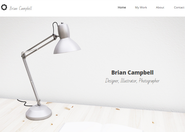
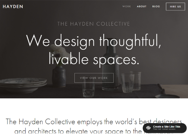
Homepage designs with a single high-quality image
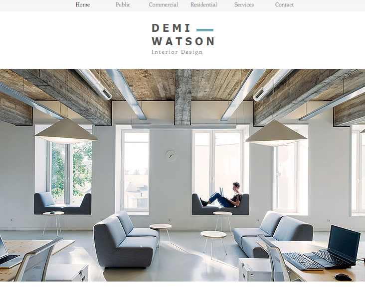
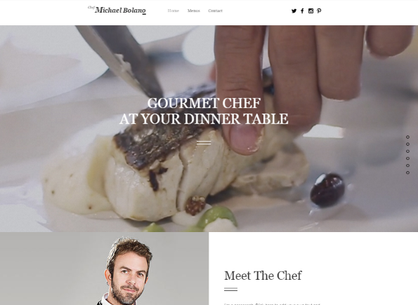
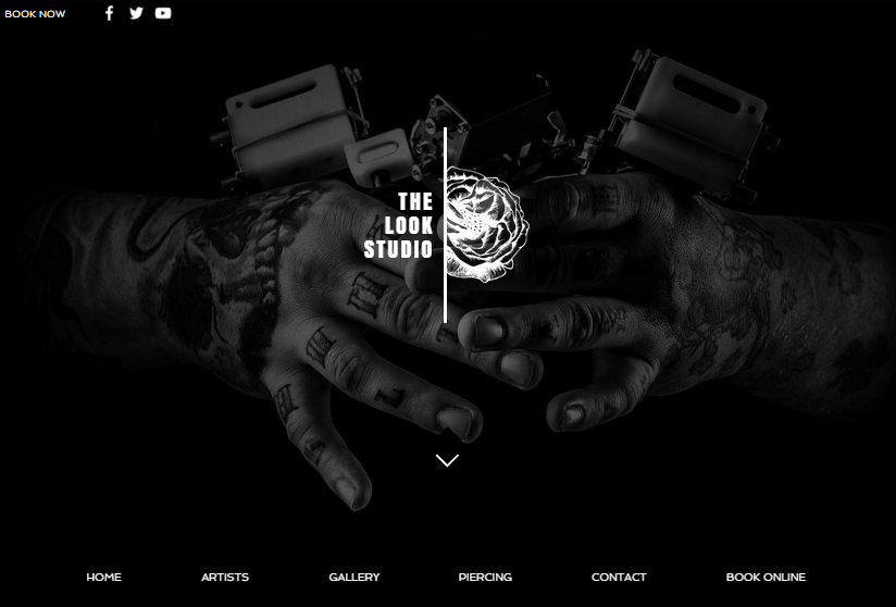
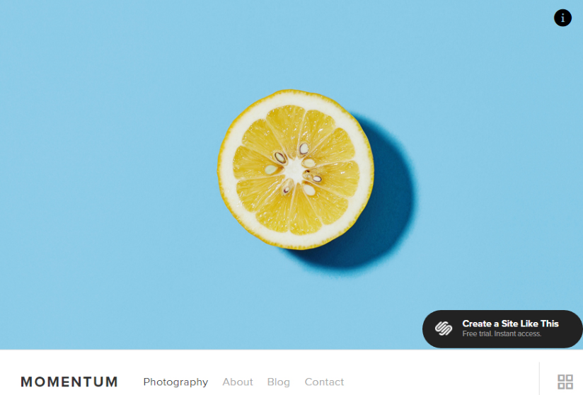
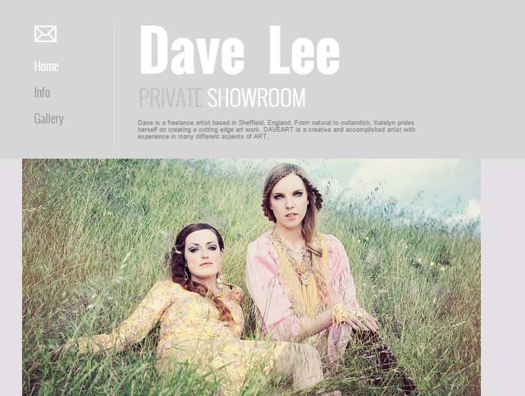
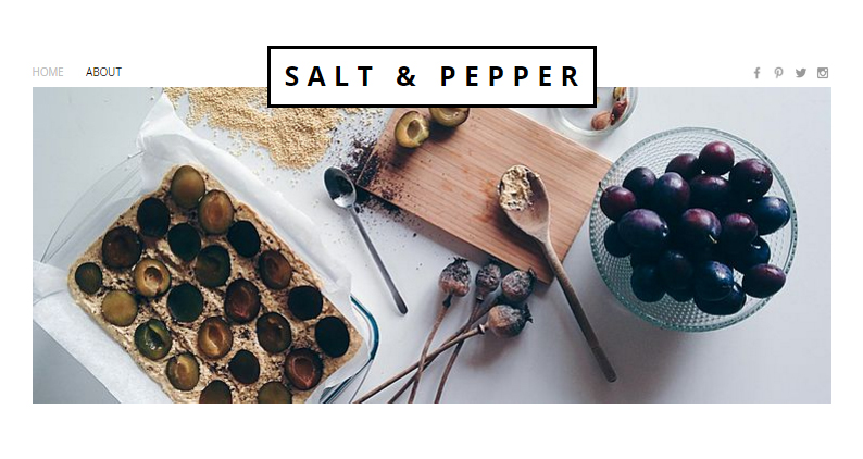
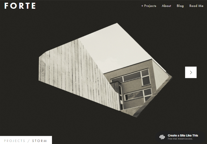
These homepages all have one large, stunning image located prominently towards the top of the
page. You can also see that the menu bars are slim, clean and clutter free. Because of the
slim menu bar/header, the image immediately becomes the focal point of the page. Your
attention is immediately drawn to the image.
This type of design is best for hospitality, portfolio (ie. interior design, architecture, artists, etc.)
or websites that rely on beautiful photographs to attract customers.
In order for this design to be effective, the image you use has to be strikingly stunning and
high-quality so that it immediately draws attention and captivate your visitor.
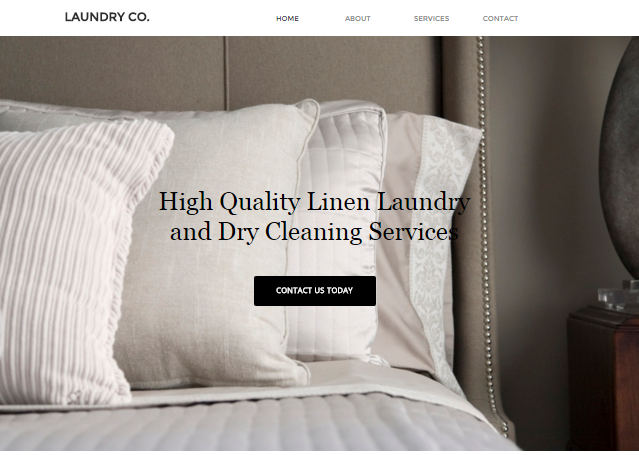
Homepage designs with a single high-quality image with content
Click to see this template from Website.com
Click to see this template from Websitebuilder.com
Click to see this template from SquareSpace
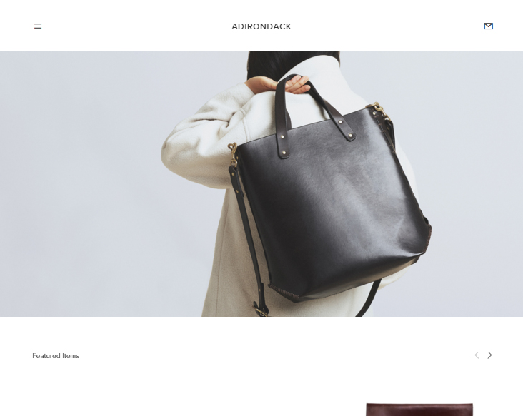
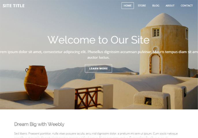
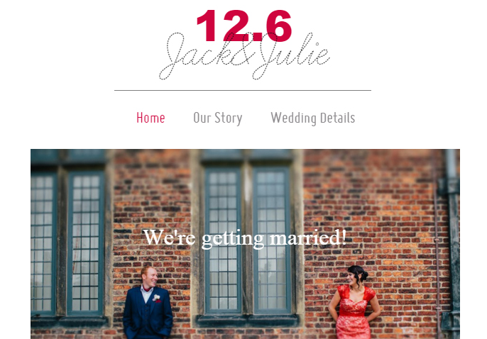
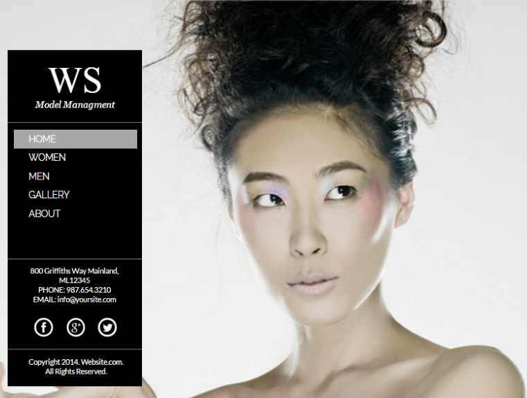
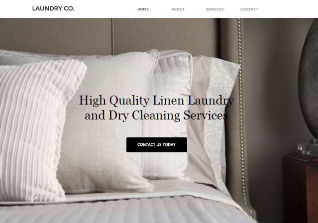
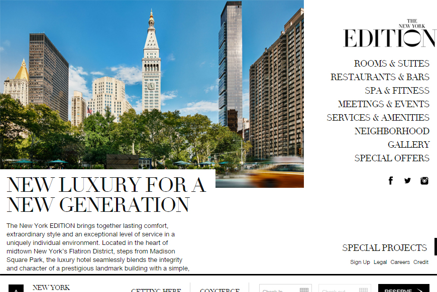
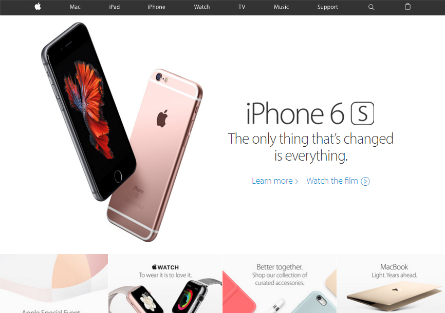
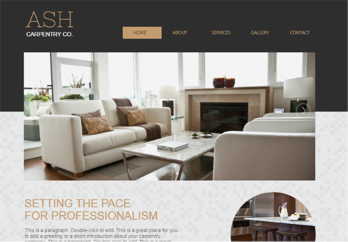
These homepages also have one large, stunning image located prominently towards the top of
the page. But instead of being the main focal point of the homepage, the images are now
supporting images – to help draw attention to the headline, supporting text and the call to
action button.
This homepage design is the safest choice and can be used for all websites.
Again, in order for this design to be effective, the image you use has to be strikingly stunning
and high-quality so that it immediately draws attention and captivate your visitor. It also
shouldn't be too distracting – you want the headline and call to action button be the center of
attention.
Example of a website using this type of homepage design is the Apple.com website.
Homepage with slider
Click to see this template from SquareSpace
Click to see this template from Website.com
Click to see this template from Wix
These homepages all feature a slider containing various stunning images. You can also see
that the menu bars are slim, clean and clutter free. Because of the slim menu bar/header, the
slider immediately becomes the focal point of the page. Your attention is immediately drawn
to the images. Because of the movement of images, it creates a wow factor and adds "interest"
to the homepage.
Because of their utility in showcasing visual content, sliders are best for product tours and
photo galleries and portfolios. They also work great when used to display information that
needs to be presented sequentially (ie. a story).
Example of a website using this type of homepage design is the Dell.com website.

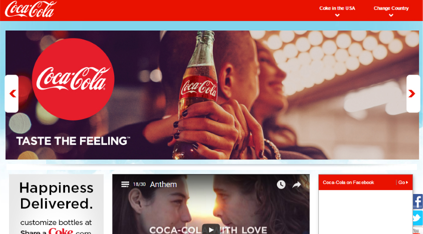
Another example of a website using this type of homepage design is the Coca-Cola.com
website. Notice how the headline in all the slides are the same – creating a consistent message
that is supported by the series of slides. These slides act as supporting images to reinforce the
taste the feeling™ message.
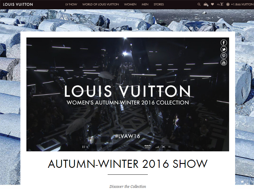
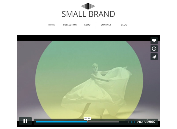
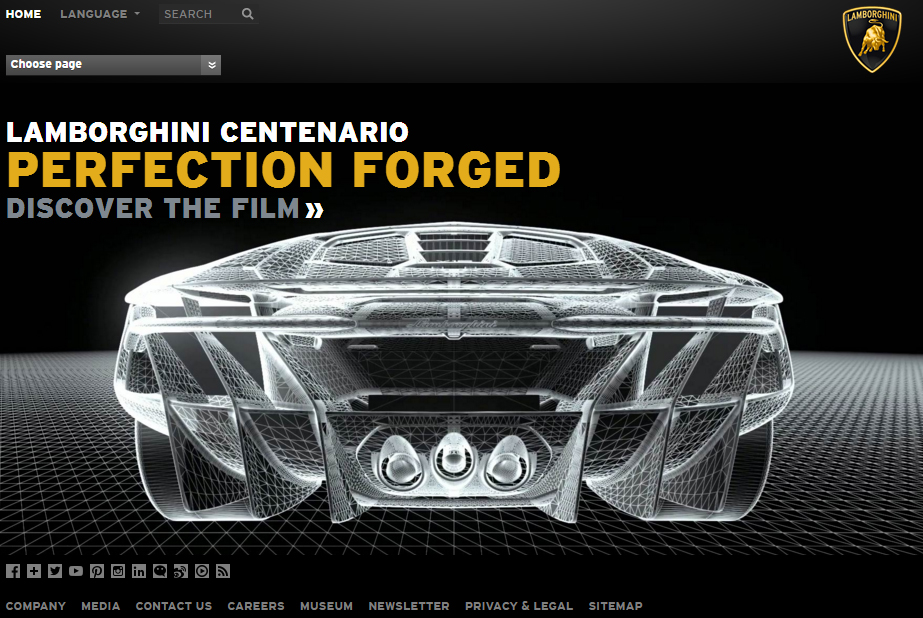
Homepage with video
Videos are very effective in getting people's attention. It adds an original, unexpected element to your
website, making it stand out and engaging. This homepage design carries enormous benefit to website
and brand awareness. This type of design is a good alternative to sliders.
This type of design works best for creative agencies and businesses/people in the entertainment
industry. But it can cost a bit to find or make the video.
Note: if you are unable to find a website template that offers a video element, you can easily just add a video to your page.
Example of a website using this type of homepage design is the louisvuitton.com website.